9 Proven Steps How To Make A Website Mobile Friendly
- April 23, 2026
- Miguel Umbac
- 10:40 am
Learn how to make a website mobile friendly by using responsive design and fast code. This process helps your site rank better on Google and look great on every phone. I use a simple framework called Build Rank Cite to help small businesses win more local customers through technical excellence.
The Mobile-First Fast Track
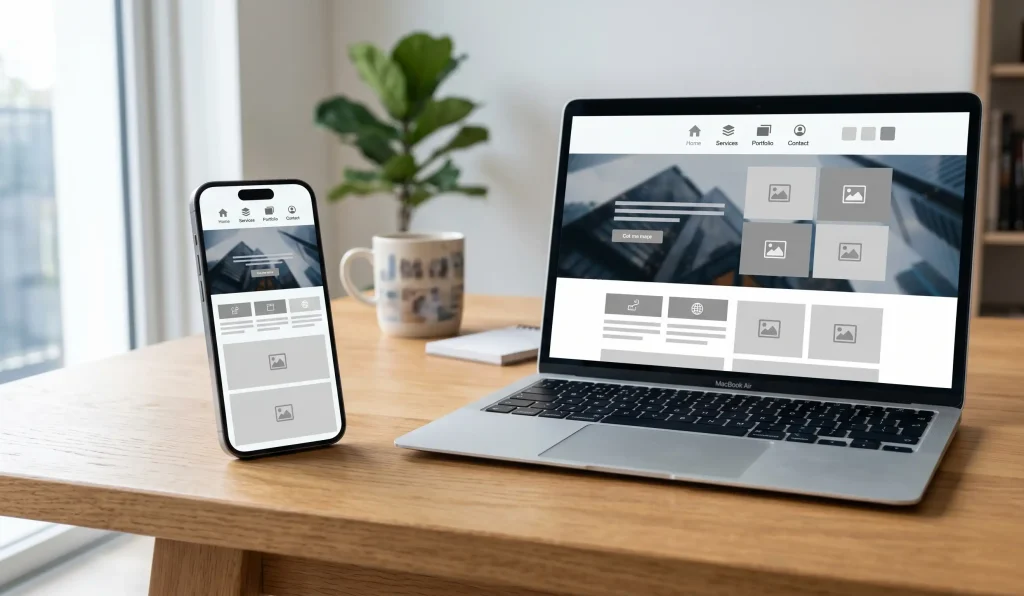
Making your site work on phones is a must for 2026. Google uses mobile-first indexing to decide your rank. This means Google looks at your mobile site first, not your desktop site. You need to use a viewport meta tag so the screen fits right. Use fluid grids and relative units so your layout stays flexible.
You should also make buttons 48×48 pixels so they are easy to tap. My method focuses on Core Web Vitals and speed. I make sure your mobile site has the same text and links as your desktop site. This is called content parity. Following these steps helps you get in the Local 3-Pack and stay ahead of others.
Technical Foundations For Modern Mobile SEO
I have spent over 3.5 years as a web developer. I see many people make the same mistakes. They build a site for a big computer and forget about the phone. Google does not like that. Google uses mobile-first indexing for every site now. If your mobile site is bad, your rank will drop.
I use the Build Rank Cite framework. First, we Build a fast site. Next, we Rank it on Google. Then, we Cite it so AI like ChatGPT can find it. This starts with a responsive web design. This means one site that fits all screens. You do not need two different websites. You just need one that is smart.
Step 1: Use Fluid Grids And Relative Units
A good site uses fluid grids. Old sites used fixed pixels. That is a mistake. If a screen is 400 pixels wide and your image is 500 pixels, it will break. I use relative units like percentages. This lets the site stretch or shrink like a rubber band.
Step 2: Set The Viewport Meta Tag
You also need the viewport meta tag. This is a tiny bit of code in the head of your site. It tells the phone how to scale the page. Without it, your site looks zoomed out. Users will have to pinch the screen to read. That is a bad experience. Most users will leave within three seconds if they can’t read your text.
Step 3: Use CSS Media Queries
I write code using a mobile-first approach. This means I plan for the smallest screen first. I use CSS media queries to tell the site when to change. For example, I use min-width media queries to add more columns when the screen gets bigger. This keeps the code clean and fast.
Clean code is vital for Core Web Vitals. Google measures how fast your page loads. If your code is messy, your site will be slow. Slow sites do not rank in the Local 3-Pack. I focus on speed so you can get more leads without spending more on ads.
Step 4: Design For Touch
Mobile users do not have a mouse. They use their thumbs. You must make your touch target size large enough. I follow the rules from Google and Apple. Every button should be at least 48×48 pixels. This stops people from clicking the wrong link by mistake.
You should also add 8 pixels of spacing between interactive elements. This is part of a clean UI. I also remove hover states. Phones do not know when a finger is hovering. If your menu only opens on a hover, mobile users can’t use it. I use a hamburger menu navigation to keep things tidy. It hides the menu until the user needs it.
Step 5: Optimize Images
Large photos are the main reason sites are slow. I use HTML srcset to fix this. This code tells the browser to pick the best image size. A phone does not need a huge 4K photo. It needs a small, sharp file. This directly affects your ROI because faster sites sell more products.
I also use the WebP image format. It is much smaller than old JPEG files. Sometimes I use the <picture> element for art direction. This lets me show a tall photo on phones and a wide photo on desktops. This keeps your site looking professional on every device without slowing it down.
Step 6: Maximize Readability And Clean UI
Your text must be easy to read. I use a font size of at least 16px. This means users do not have to zoom in to see your message. I also simplify your site. A clean site is a fast site.
I look out for the interstitial penalty. This happens if you have big pop-ups that cover the whole screen. Google will punish your site for this. Keep your site easy to use and free of clutter to stay in Google’s good graces.
Step 7: Improve Mobile Page Speed
Mobile phones often use slow data. You must improve mobile page speed to keep users happy. I compress all code and defer non-critical JavaScript. This makes the page load the text first. People stay on your site when they do not have to wait.
I never use Adobe Flash. It does not work on phones and it is very slow. Speed is the most important part of my Build Rank Cite framework. If your site is slow, your marketing will fail.
Step 8: Maintain Content Parity
Many people hide text on mobile to save space. Do not do this. Google needs to see the same info on both versions. This is called content parity. If you hide your keywords on mobile, you will lose your rank. This is a common error I fix for my clients.
I use accordions or tabs to hide the mess but keep the text. This keeps the page short but the data stays for Google. I also check for internal link parity. Your mobile site must have the same links as your desktop site. This helps Google crawl your whole site easily and keeps your authority high.
Step 9: Test On Real Devices
Tools are good, but real phones are better. I test every site on real iPhones and Androids. I check both portrait and landscape views. This ensures your site works for everyone.
I look for any layout shift. If a button moves while the page is loading, it hurts your score. It also makes users mad. I make sure everything stays in place before the site goes live.
Why Technical Audits Save Your Rankings
I run a technical SEO audit on every project. I look at the Cumulative Layout Shift (CLS). I also check main thread work. These are just ways to ask if the site is stable and fast.
If the site is slow, I fix the code. I do not stop until it is perfect. I serve clients in the USA, UK, Australia, and the Philippines. Each one gets the same high level of care.
Expert Services To Grow Your Brand
Check out my local SEO services to rank higher. I help you win the Local 3-Pack. This brings more calls to your business.
I also offer web design and development. These sites are built for speed. If you want to save time, look at my ai and workflow automation services.
Follow Modern Search Standards
I stay up to date with the best rules. You can learn more at web.dev. You can also read the Google Search Central blog.
For very deep rules, I use the W3C Mobile Web Best Practices. This keeps your site safe from future changes. I build sites that last for years, not months.
My Personal Business Values
My business value is simple. I offer low overhead. I do not have a big office or many managers. This keeps prices low for you.
You talk directly to me. There is no middle man to confuse things. I do not use long contracts. I want you to stay because you see real results.
Every Dollar Must Bring Results
Every dollar you spend must bring back more money. That is my goal. I focus on what works and cut out the fluff. This is how I help small businesses grow.
Small businesses need experts who care about their budget. I treat your money like my own. I focus on speed and rank to get you the best return.
Preparing Your Site For AI Search
I make sure your site is ready for the future. This includes using AEO and GEO. This helps tools like ChatGPT and Gemini find you.
When your site is mobile friendly, AI tools can read it better. This helps them recommend you to new leads. This gives you a modern reach that others lack.
Frequently Asked Questions
Why is my website not mobile friendly?
Your site might lack a viewport meta tag or use fixed widths. It could also have buttons that are too small to tap. I can run an audit to find the exact technical errors and fix them for you.
Does mobile-friendly affect SEO?
Yes, it is one of the most important factors. Google uses mobile-first indexing for all websites. If your mobile site is slow or hard to use, you will not rank well in search results.
How can I check my mobile speed?
You can use tools like Google PageSpeed Insights. It will show you your Core Web Vitals. I look for high scores in speed and stability to help you win the Local 3-Pack and get more calls.
Should I have a separate mobile site?
No, you should use responsive web design. This keeps all your content on one URL. It is better for your brand and much easier for Google to understand and index.
Get A Mobile Friendly Site Today
Stop losing customers because your site is hard to use on a phone. I build fast sites that rank high and turn visitors into leads.
Article by
Miguel Umbac
Miguel Umbac is an SEO Specialist & Web Developer and the founder of Built by Miguel. With over 3.5 years of experience in SEO and 9 years in technical support, he focuses on building high-speed, SEO-first websites that rank. Miguel specializes in “Local Domination” engines that help businesses win the Google Map Pack. He also integrates AI and workflow automations using tools like n8n and GoHighLevel to handle lead follow-ups,